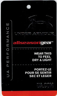
 This is a hang tag from sports apparel brand Under Armour. I've reviewed several of their other hang tags, some very favorably, in previous posts. This tag is small in size, and busy. The front is a black background, with a reflective UA logo, and additionally a reflective variation on a name.com address. The other primary colors are orange and white, white being used for much of the text and orange for logos and as an accent color.
 There is some odd UA PERFORMANCE text going vertically upwards on the left side, which has brackets flowing across the tag. Visually, it transitions to the instructional text, asking purchasers to "Wear this to feel dry and light." Bizarre, to say the least, but it likely grows out of the multiple "lines" that UA traditionally offers (ColdGear, HeatGear, and this, AllSeasonGear). That text is repeated in French, although Spanish is not present.
The reverse is somewhat less busy. The reflective logo appears again, although this time it is a circular shield with UA's "Universal Guarantee of Performance" and somewhat famous "Protect This House" trademarks. There is a large retailer tag affixed in the retailer tag space, with more UA markings below, as well as the copyright notice.
This tag is pretty disastrous. The front is a hodge-podge of different designs, texts, and ideas, none of which come together with any cohesion. It is like they started with a black tag with a logo, then someone said, Add in the Orange for our All Season line, then someone else said, We have to get that UA Performance marking on it, then someone else said, Its too confusing, add wearing instructions, then legal got involved and added the French. This is a prime example of a company viewing its hang tags as after thoughts, the necessary evil that goes along with the clothing. It needs to be stripped down and redesigned from top to bottom.
The wearing instructions are odd, but mostly from a clothing design standpoint and not from a hang tag perspective. The use of French but not Spanish is confusing, but it doesn't appear to be faux-French so I give it a pass. I'm of the mindset that each region that requires a different language should get its own hang tag.
The reverse is much better, simply by having less on it, but this tag remains rotten with trademark usage. UA seems to have vomited half of their portfolio onto this one, infant sized, tag. The gift receipt on the retailer sticker is laughable since the physical tag itself doesn't have gift receipt space itself, compounded further by the fact that this is an Under Armour retailer tag. Even within their own distribution channel they couldn't get it straight.
One thing I will give credit for here is the nice use of reflective lettering and logos. The silver against the black background looks sharp. I'll also give a pass for the name.com since it is an abbreviation of the name. I think the simple UA.COM looks great on this tag and is well worth including.
No comments:
Post a Comment